How to Use the Product-Led Pirate Metrics Wheel
Master product-led growth by turning vague questions into targeted investigations. Use the Pirate Metrics Wheel to identify drop-offs, assign ownership, and track only the metrics that matter. Build clarity, align teams, and drive smarter decisions with a powerful measurement system.


If you haven't read the framework yet, start there. This guide assumes you understand the six stages (Awareness, Acquisition, Activation, Revenue, Retention, Referral), the difference between leading and lagging indicators, and why handoffs between stages matter.
Now you need to know: how do you actually use this information to build your measurement system?
What the Wheel Is (And Isn't)
The Product-Led Pirate Metrics Wheel is a comprehensive visual map of over 100 metrics across all six stages of product-led growth. Think of it like a periodic table of elements for growth metrics.
A chemist doesn't use all 118 elements for every experiment. But having them organized by properties, seeing how they relate to each other, and knowing what's possible allows them to select exactly the right elements for their specific need.
The wheel does the same thing for your measurement system.
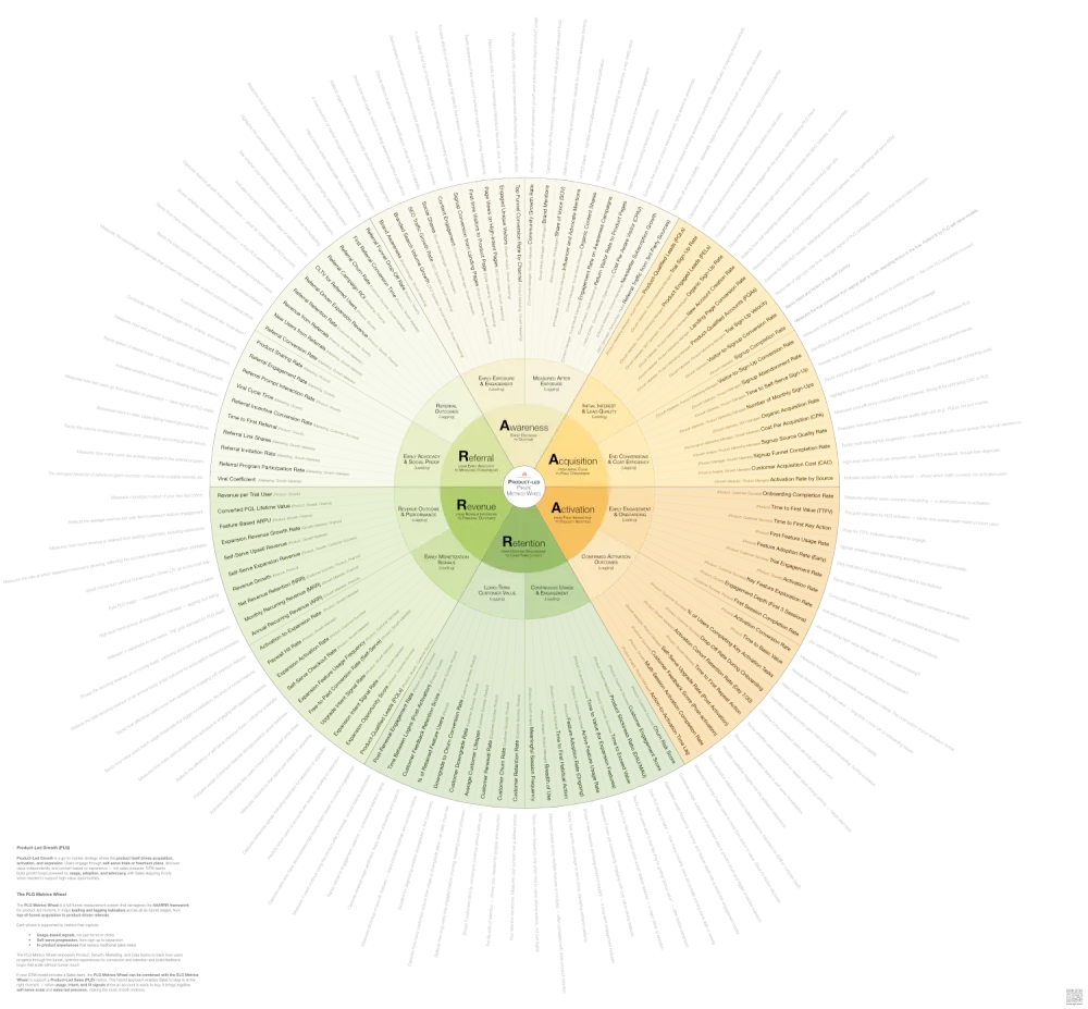
The Product-Led Pirate Metrics Wheel
Align your teams around the metrics that drive product-led growth. Track what matters—from first touch to expansion—across the full AAARRR funnel.
Each metric is tagged with which stage it measures, whether it's a leading or lagging indicator, who typically owns it, and how it connects to metrics in other stages.
The wheel is NOT a to-do list. You will not implement all 100+ metrics. You'll select 10-15 that matter most for your business right now. The wheel is a reference library that shows you what's possible so you can choose what's necessary.
Why You Need the Wheel
It Shows You What You're Not Measuring
Most product-led companies track what their analytics tools make easy to measure. Product tracks what Amplitude or Mixpanel tracks. Growth tracks what Google Analytics tracks. Nobody designed the system—they inherited it tool by tool.
Open the wheel and compare it to your current dashboard. You'll discover you have 15 metrics for signups but zero for the signup-to-activation handoff. You track activation rate but none of the leading indicators that predict it—like Time to First Value or Day 1 Return Rate. You measure churn rate but not the behavioral signals that show users are about to churn—like Product Engagement Score or Feature Adoption Breadth.
The wheel exposes your blind spots by showing you the complete universe of what you could be tracking.
It Reveals How Metrics Connect
The circular format shows you something dashboards can't: how performance in one stage affects all the others.
Trace the connection from Signup-to-Activation Rate (Stage 2: Acquisition) to Time to First Value (Stage 3: Activation). When you improve acquisition quality, time to value decreases. When Time to First Value improves, Activation Rate increases. When more users activate, Free-to-Paid Conversion Rate goes up and Product Engagement Score stays high.
This creates alignment. When Growth sees their signup quality directly impacts Product's activation metrics, they change their targeting. When Product sees Feature Adoption Breadth predicts Net Revenue Retention, they change what features they build.
The connections that seem obvious on the wheel are invisible when each team only looks at their own dashboard.
It Turns Vague Questions Into Specific Investigations
"Why is our growth slowing?" is unanswerable. The wheel helps you ask better questions.
Your MRR growth rate is declining. Check each stage's lagging indicators. Branded Search Volume steady. Total Signups up 15%. Activation Rate dropped 22%. Free-to-Paid Conversion Rate stable but Expansion MRR flat.
The problem reveals itself. Look at the Activation section of the wheel. The leading indicators show you Time to First Value, First Session Depth, Day 1 Return Rate, Onboarding Completion Rate, Feature Discovery Rate, and Empty State Conversion Rate.
Pull those six metrics. One of them shows you exactly where users are getting stuck.
💡
Tip: Not sure what a KPI measures or how to use it? The KPI Library includes plain-language definitions, ownership guidance, and stage connections — so you always know exactly what you're tracking and why.
How to Use the Wheel
Step 1: Identify Your Biggest Drop-Off
Where are you losing the most users? Signup to activation? Activation to conversion? Conversion to retention?
Look at your funnel. Calculate the percentage who make it through each stage. Signup to first session: 60%. First session to activation: 25%. Activation to paid: 8%. Paid to retained: 75%.
Your biggest leak is signup to activation. Only 25% of users who start their first session actually activate.
Open the wheel. Find the Activation stage. You're going to fix this first.
Step 2: Select Your Core Metrics
Look at the metrics in the Activation stage. The wheel organizes them into leading indicators that predict what's coming and lagging indicators that confirm what happened.
Select 2-4 metrics using this formula:
- One or two leading indicators to predict what's about to happen and give you time to intervene
- One lagging indicator to confirm outcomes and validate your strategy
- One handoff metric to track the transition into or out of this stage
Your biggest drop-off is activation. Users sign up but never experience value.
The wheel shows leading indicators: Time to First Value, First Session Depth, Day 1 Return Rate, Onboarding Completion Rate, Feature Discovery Rate, Empty State Conversion Rate.
And lagging indicators: Activation Rate, Week 1 Retention, Product-Qualified Accounts, Percent Reaching Aha Moment.
You select: Time to First Value (shows how quickly users experience core value), Day 1 Return Rate (predicts if users will build habits), Activation Rate (confirms how many users complete the core action), and Empty State Conversion Rate (measures the signup-to-first-session handoff).
Four metrics. Not fifteen.
Step 3: Assign Single-Threaded Ownership
Every metric needs one person or team who owns it. Not "Product and Growth co-own it"—that means nobody owns it.
The wheel shows typical ownership: Time to First Value (Product, Growth), Day 1 Return Rate (Product, Growth), Activation Rate (Product, Growth), Empty State Conversion Rate (Product, Growth).
In product-led companies, Product or Growth typically owns these metrics. Adapt to your org structure. Write down: Metric: Time to First Value. Owner: VP of Product. Accountable when it trends wrong: VP of Product.
If a metric trends in the wrong direction, someone specific should feel responsible for fixing it.
Step 4: Track the Handoffs
Most measurement systems track stages. The wheel shows you the transitions between stages—where context gets lost, where users drop off, where momentum dies.
Look at the space between Activation and the stage before it. The Acquisition-to-Activation handoff shows several metrics: Time from signup to first login, Signup completion rate, Email engagement rates in first 24 hours, Empty State Conversion Rate.
Track Time from Signup to First Login and Empty State Conversion Rate. You discover: 40% of users who sign up never complete their first session. Of those who do, 70% see an empty dashboard and leave immediately. The handoff is broken—users sign up but nothing guides them back, and when they do return, they see no value.
Step 5: Build System Visibility
Create one shared view where Product, Growth, Marketing, and Engineering can see the metrics you selected from the wheel, how those metrics connect to each other, who owns each metric, and current performance and trends.
A shared dashboard in your analytics tool works. A simple spreadsheet works. The point is visibility, not perfection.
Show the full journey from Awareness to Referral, with your selected metrics highlighted at each stage. Teams should be able to see: "When I improve my metric, what happens downstream?"
Acquisition: Signup-to-Activation Rate (Growth) → 25%, trending down. Activation: Time to First Value (Product) → 8 minutes, too slow. Activation: Empty State Conversion Rate (Product) → 30%, critical problem. Activation: Day 1 Return Rate (Product) → 18%, trending down. Revenue: Free-to-Paid Conversion Rate (Product) → stable at 8%.
Growth sees their signup quality impacts activation. Product sees their slow Time to First Value and poor Empty State experience kills retention. Everyone sees the system, not just their piece.
Step 6: Run Experiments and Expand
Once you've identified the problem, run experiments to fix it. PLG is about rapid iteration. Use metrics to prioritize experiments and measure impact.
For your activation problem, you might test: reducing Time to First Value with better onboarding, improving Empty State Conversion with starter templates, increasing Day 1 Return Rate with better email sequences.
Ship the experiment. Measure the impact on your selected metrics. If Time to First Value drops from 8 minutes to 3 minutes and Activation Rate increases from 25% to 35%, you've fixed it.
Once you've fixed your weakest stage, return to the wheel. Find the next priority stage. Select 2-4 metrics from that section using the same formula.
Keep expanding until you can see the full customer journey. You'll end up with 10-15 metrics total across all six stages—not all 100+.
The wheel remains your reference. When new problems emerge, when growth slows, when you need to diagnose a drop in performance, you return to the wheel and select the right metrics for that moment.
The Wheel in Action
These six steps sound abstract. Here's what they look like in practice.
Growth Is Slowing But Signups Are Up
Total Signups increased 30% quarter-over-quarter. But MRR growth only increased 5%. Something's broken.
Check the lagging indicators across stages: Branded Search Volume up 15%. Total Signups up 30%. Activation Rate down from 32% to 24%. Free-to-Paid Conversion Rate stable at 6%. Net Revenue Retention dropped from 105% to 98%.
Two problems: Activation and Retention. More users are signing up, but fewer are activating. Those who do activate and pay aren't expanding.
The Activation leading indicators tell the story: Time to First Value increased from 4 minutes to 9 minutes. Day 1 Return Rate dropped from 28% to 19%. Empty State Conversion Rate fell from 45% to 32%.
The Retention leading indicators confirm it: Product Engagement Score down 15%. Feature Adoption Breadth flat—users aren't exploring beyond core features. Collaboration Depth dropped—fewer users are adding teammates.
Users are signing up but experiencing value more slowly. The onboarding experience degraded. Those who do convert aren't expanding usage or inviting teammates.
The wheel diagnosed two specific problems in 10 minutes.
Churn Spiked But You Don't Know Why
Last quarter, Customer Churn Rate was 3.5%. This quarter it's 6.8%. What changed?
Pull the Retention leading indicators that should have predicted this: Product Engagement Score, Feature Adoption Breadth, Churn Risk Score, DAU/WAU ratio, Collaboration Depth, Support Ticket Sentiment.
Product Engagement Score started declining 90 days ago—users logging in less frequently, shorter sessions. DAU/WAU ratio dropped from 0.45 to 0.32 over the same period. Collaboration Depth stayed flat—no growth in teammates or shared workspaces. But Churn Risk Score didn't catch it because the model overweighted Feature Adoption Breadth, which stayed stable.
You're maintaining surface-level feature usage but losing daily habit formation. Users aren't building your product into their workflow. They stay subscribed for a while but eventually cancel because they're not getting enough value.
Rebuild your Churn Risk Score to weight Product Engagement Score and DAU/WAU ratio more heavily. Add these two leading indicators to your weekly product review. Design experiments to increase daily habit formation—better notifications, workflow integrations, regular use cases.
Free-to-Paid Conversion Dropped After Pricing Change
You changed your pricing model last month. Free-to-Paid Conversion Rate dropped from 9% to 5.5%. Revenue per user increased, but overall MRR growth is flat because fewer users are converting.
The wheel shows Revenue leading indicators: Product-Qualified Leads, Usage Threshold Approach Rate, Feature Gate Engagement, Expansion Feature Usage, Free-to-Paid Time.
Pull the data. Product-Qualified Leads volume stayed the same—users are reaching high-value behaviors. But Feature Gate Engagement dropped 60%—users hit paywalls and bounce instead of converting. Free-to-Paid Time increased from 14 days to 28 days for those who do convert.
Your new pricing model puts features behind paywalls that users need earlier in their journey. They hit friction before experiencing enough value to justify paying. The timing is wrong—you're asking for money when users are frustrated, not delighted.
Run experiments on paywall placement. Move some features into the free tier to extend time to value. Test upgrade prompts at moments of peak value rather than limitation.
Special Consideration: Product-Led Sales (PLS)
Many product-led companies add Sales for high-value accounts or complex deals. This creates a hybrid model where product drives initial growth and sales accelerates expansion.
The key question: When should Product hand off to Sales?
The wheel helps you identify Product-Qualified Lead signals:
- Team size crosses a threshold (e.g., 10+ users in Collaboration Depth)
- Usage velocity indicates enterprise need (high Product Engagement Score + rapid Feature Adoption Breadth)
- User requests features only available in enterprise tier (tracked in Feature Gate Engagement)
- Account fits your ideal customer profile for sales-assisted deals
- Engagement patterns match your best paying customers (identified through cohort analysis)
Track the PLS handoff: Product identifies the PQL. Sales receives context—which features they're using, which problems they're solving, who the key users are, what triggered the PQL flag. Sales reaches out with relevance, not cold outreach. The conversation builds on product momentum.
Metrics for the PLS handoff:
- PQL identification rate (how many high-value accounts are you flagging)
- PQL-to-sales-contact time (speed of handoff)
- PQL-to-opportunity conversion rate (quality of handoff)
- Sales-assisted deal size vs. self-serve (value of sales involvement)
- Context transfer quality (measured through win/loss analysis)
If you're running PLS, use both the PLG Metrics Wheel for product-driven stages and the SLG Metrics Wheel for sales-assisted stages.
The Wheel Is Your Reference, Not Your Checklist
The wheel contains 100+ metrics organized across six stages, split into leading and lagging indicators, with ownership guidance for each one. You'll use 10-15 of them.
The power isn't in tracking everything—it's in tracking the right things and iterating rapidly based on what you learn.
The wheel shows you what you're not measuring, how metrics connect, where to investigate, and who should own what. Use it as a reference library. Return to it when growth slows, when performance drops, when you need to diagnose new problems, or when you're ready to add the next stage to your measurement system.
The goal isn't a perfect measurement system. The goal is understanding where users get stuck and systematically removing friction.
The Product-Led Pirate Metrics Wheel
Align your teams around the metrics that drive product-led growth. Track what matters—from first touch to expansion—across the full AAARRR funnel.
Written by

Subscribe to my newsletter
Subscribe to my newsletter to get the latest updates and news