How to Use the Sales-Led Pirate Metrics Wheel
The Sales-Led Pirate Metrics Wheel helps you identify blind spots, fix weak handoffs, and select 10–15 key metrics that align Marketing, Sales, Product, and Success. Stop tracking everything—start tracking what moves revenue. Use it as your diagnostic toolkit for scalable growth.


If you haven't read the framework yet, start there. This guide assumes you understand the six stages (Awareness, Acquisition, Activation, Revenue, Retention, Referral), the difference between leading and lagging indicators, and why handoffs between stages matter.
Now you need to know: how do you actually use this information to build your measurement system?
What the Wheel Is (And Isn't)
The Sales-Led Pirate Metrics Wheel is a comprehensive visual map of over 100 metrics across all six stages of sales-led growth. Think of it like a periodic table of elements for growth metrics.
A chemist doesn't use all 118 elements for every experiment. But having them organized by properties, seeing how they relate to each other, and knowing what's possible allows them to select exactly the right elements for their specific need.
The wheel does the same thing for your measurement system.
Each metric is tagged with which stage it measures, whether it's a leading or lagging indicator, who typically owns it, and how it connects to metrics in other stages.
The wheel is NOT a to-do list. You will not implement all 100+ metrics. You'll select 10-15 that matter most for your business right now. The wheel is a reference library that shows you what's possible so you can choose what's necessary.
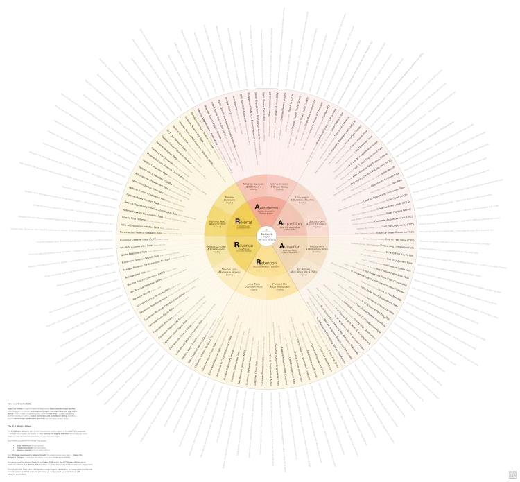
The Sales-Led Pirate Metrics Wheel
Stop guessing which metrics matter. This wheel aligns Sales, Marketing, Product, and Success around the KPIs that actually drive growth—at every stage.
Why You Need the Wheel
It Shows You What You're Not Measuring
Most companies only measure what their tools make easy to measure. Marketing tracks what HubSpot tracks. Sales tracks what Salesforce tracks. Product tracks what Amplitude tracks. Nobody designed the system—they inherited it tool by tool.
Open the wheel and compare it to your current dashboard. You'll discover you have 15 metrics for acquisition but zero for the acquisition-to-activation handoff. You track Customer Churn Rate but none of the leading indicators that predict it—like Customer Health Score or Churn Risk Score. You measure Annual Recurring Revenue but not the expansion signals that show deals are about to grow—like Expansion Intent Signal Rate or Upgrade Intent Signal Rate.
The wheel exposes your blind spots by showing you the complete universe of what you could be tracking.
It Reveals How Metrics Connect
The circular format shows you something spreadsheets can't: how performance in one stage affects all the others.
Trace the connection from Lead Quality Score (Stage 2: Acquisition) to Trial Engagement Rate (Stage 3: Activation). When Marketing improves lead quality, trial engagement goes up. When Trial Engagement Rate improves, % of Accounts Reaching PQL increases. When more accounts reach Product-Qualified Lead status, Win Rate improves and Sales Cycle Length decreases.
This creates alignment. When Marketing sees their Lead Quality Score directly impacts Product's Trial Engagement Rate and Sales' PQL conversion, they change how they source leads. When Product sees Feature Adoption Rate predicts Expansion Revenue Rate, they change their roadmap priorities.
The connections that seem obvious on the wheel are invisible when each team only looks at their own dashboard.
It Turns Vague Questions Into Specific Investigations
"Why aren't we growing?" is unanswerable. The wheel helps you ask better questions.
Your Revenue Growth trend is flat. Check each stage's lagging indicators. Share of Voice holding steady. MQL volume up, but Lead Quality Score down. Activation Conversion Rate dropped 15% last quarter. Win Rate stable but Deal Velocity slowing.
The problem reveals itself. Look at the Activation section of the wheel. The leading indicators show you Time to First Value, Trial Engagement Rate, % of Users Engaging with Top Activation Features, Time to First Key Action, and % of Accounts with Multi-Role Engagement.
Pull those five metrics. One of them shows you exactly where prospects are dropping off.
How to Use the Wheel
Step 1: Identify Your Weakest Stage
Where are you losing the most deals or customers? Where does momentum die most often?
Ask your team: Sales, where do deals go to die in your pipeline? Customer Success, when do customers start showing churn risk? Marketing, where do leads drop off most? Product, where do trial users abandon the product?
You'll hear patterns. "Deals die after the demo." "Customers churn in months 4-6." "Trials never activate."
Open the wheel. Find that stage. You're going to fix this first.
Step 2: Select Your Core Metrics
Look at the metrics in your weakest stage. The wheel organizes them into leading indicators that predict what's coming and lagging indicators that confirm what happened.
Select 2-4 metrics using this formula:
- One or two leading indicators to predict what's about to happen and give you time to intervene
- One lagging indicator to confirm outcomes and validate your strategy
- One handoff metric to track the transition into or out of this stage
Your weakest stage is Activation. Sales delivers demos but trials don't convert.
The wheel shows leading indicators: Time to First Value, Trial Engagement Rate, Time to First Key Action, % of Users Engaging with Top Activation Features, Lead Response Time (Post-Onboarding), Time to First Meeting, % of Accounts with Multi-Role Engagement.
And lagging indicators: Activation Conversion Rate, % of Accounts Reaching PQL, % of Accounts with 3+ Activated Users, % of Accounts Completing Key Activation Milestones.
You select: Trial Engagement Rate (predicts which trials will convert), Time to First Value (shows how quickly prospects experience value), % of Accounts Reaching PQL (confirms activation success), and Lead Response Time Post-Onboarding (measures the demo-to-trial transition speed).
Four metrics. Not fifteen.
💡
Tip: Not sure what a KPI measures or how to use it? The KPI Library includes plain-language definitions, ownership guidance, and stage connections — so you always know exactly what you're tracking and why.
Step 3: Assign Single-Threaded Ownership
Every metric needs one person or team who owns it. Not "Sales and Marketing co-own it"—that means nobody owns it.
The wheel shows typical ownership in parentheses: Trial Engagement Rate (Product, Sales, Customer Success), Time to First Value (Product, Customer Success), % of Accounts Reaching PQL (Product, Sales Enablement, RevOps), Lead Response Time Post-Onboarding (Sales, Customer Success).
Adapt to your org structure. Write down: Metric: Trial Engagement Rate. Owner: VP of Product. Accountable when it trends wrong: VP of Product.
If a metric trends in the wrong direction, someone specific should feel responsible for fixing it.
Step 4: Track the Handoffs
Most measurement systems track stages. The wheel shows you the transitions between stages—where context gets lost, where delays happen, where deals die.
Look at the space between your weakest stage and the stage before it. You're fixing Activation. The Acquisition-to-Activation handoff shows several metrics: Lead Response Time, Time to First Contact, Lead Response Time Post-Onboarding, Time to First Meeting.
Track Time to First Meeting and Lead Response Time Post-Onboarding. You discover: Demos happen, trial access gets sent, but Sales doesn't reach back out until 5 days later. By then, the trial user already gave up. The handoff is broken, not the activation experience itself.
Step 5: Build System Visibility
Create one shared view where all teams can see the metrics you selected from the wheel, how those metrics connect to each other, who owns each metric, and current performance and trends.
A shared spreadsheet works. A simple dashboard works. The point is visibility, not perfection.
Show the full journey from Awareness to Referral, with your selected metrics highlighted at each stage. Teams should be able to see: "When I improve my metric, what happens downstream?"
Acquisition: Lead Quality Score (Marketing Ops) → trending down. Activation: Trial Engagement Rate (Product) → trending down. Activation: Time to First Value (Product) → stable. Activation Handoff: Lead Response Time Post-Onboarding (Sales) → increased to 5 days. Revenue: % of Accounts Reaching PQL (Sales Enablement) → trending down.
Marketing sees their Lead Quality Score impacts Trial Engagement. Sales sees their slow Lead Response Time Post-Onboarding kills PQL conversion. Everyone sees the system, not just their piece.
Step 6: Expand Stage by Stage
Once you've fixed your weakest stage, return to the wheel. Find the next priority stage. Select 2-4 metrics from that section using the same formula.
Keep expanding until you can see the full customer journey. You'll end up with 10-15 metrics total across all six stages—not all 100+.
The wheel remains your reference. When new problems emerge, when priorities shift, when you need to diagnose a drop in performance, you return to the wheel and select the right metrics for that moment.
The Wheel in Action
These six steps sound abstract. Here's what they look like in practice.
Pipeline Looks Healthy But Revenue Is Flat
You have plenty of opportunities in Salesforce. Win Rate looks okay at 28%. But Revenue Growth is flat.
Check the lagging indicators across stages: Share of Voice holding steady at 18%. MQL volume up 20%, but SQL volume only up 5%. % of Accounts Reaching PQL down 15%. Deal Velocity increased 30%.
Activation and Revenue velocity are the problems. Deals are getting into pipeline but taking longer to close, and fewer trials are reaching PQL status.
The Activation leading indicators tell the story: Time to First Value increased from 3 days to 7 days. % of Accounts with Multi-Role Engagement dropped from 45% to 28%. Trial Engagement Rate down 12%.
Revenue leading indicators confirm it: Deal Velocity shows deals stuck in late-stage gates. Expansion Intent Signal Rate is flat.
Prospects aren't experiencing value quickly enough, and you're not engaging multiple stakeholders early. Sales is running single-threaded conversations that stall.
The wheel diagnosed the specific problem in 10 minutes.
Churn Suddenly Spiked
Three months ago, Customer Churn Rate was 5%. Now it's 9%.
Pull the Retention leading indicators that should have predicted this: Customer Health Score, Churn Risk Score, Relationship Depth Score, QBR Engagement Rate, Active Feature Usage Rate, Customer Engagement Score.
QBR Engagement Rate dropped from 80% to 45% six months ago. Relationship Depth Score followed 90 days later. But Customer Health Score didn't catch it—the score overweights Active Feature Usage Rate, which stayed stable.
You're maintaining product engagement but losing executive relationships. Your customers' champions are leaving or getting reassigned. By the time renewal conversations happen, you're talking to people who don't know you.
Rebuild Relationship Depth Score tracking and QBR discipline. Add these two leading indicators to your weekly CS dashboard.
Marketing and Sales Blame Each Other
Marketing says: "We delivered 500 MQLs this quarter—we hit our target."
Sales says: "The leads are garbage."
Put the wheel between them.
The Acquisition metrics tell the real story: MQL volume up 40%. Lead Quality Score down 25%. Sales-Qualified Leads flat. Lead-to-Opportunity Conversion Rate down 18%.
The handoff metrics add context: Lead Response Time increased from 1 hour to 6 hours. Time to First Contact increased from 2 hours to 8 hours. First Contact Engagement Rate dropped from 35% to 22%.
Marketing is hitting volume targets but Lead Quality Score dropped. Sales Development is following up slower with less effective messaging, making even good leads convert poorly.
Both teams have work to do. The wheel makes that clear without blame by showing the complete system.
The Wheel Is Your Reference, Not Your Checklist
The wheel contains 100+ metrics organized across six stages, split into leading and lagging indicators, with ownership guidance for each one. You'll use 10-15 of them.
The power isn't in tracking everything—it's in tracking the right things.
The wheel shows you what you're not measuring, how metrics connect, where to investigate, and who should own what. Use it as a reference library. Return to it when priorities shift, when performance drops, when you need to diagnose new problems, or when you're ready to add the next stage to your measurement system.
The goal isn't a perfect measurement system. The goal is a system that helps you make better decisions about where to intervene.
The Sales-Led Pirate Metrics Wheel
Stop guessing which metrics matter. This wheel aligns Sales, Marketing, Product, and Success around the KPIs that actually drive growth—at every stage.
Written by

Subscribe to my newsletter
Subscribe to my newsletter to get the latest updates and news